

This is my final post, I have really enjoyed this media studies course and I hope you enjoy my work!
[This blog is now closed]
Friday, 6 May 2011
Final Post...
Tuesday, 3 May 2011
Evaluation Question 4; How did you use media technologies in the construction and research, planning and evaluation stages?
We decided to answer this evaluation question using a different media platform/technology as the question is all about how we have used different media technologies in all the different stages of our production process.
We recorded a voice over on our Flip camera, of all four of us talking about the different technologies we used and how they were a benefit or a hindrance to us in our production process.
Here is the video we made with the voice over on it...
We simply edited the voice over onto our music video (muted) to reinforce the answers we are giving and then we also added in some picture in picture images to give a visual of what we are talking about.
Evaluation Question 3; What have you learned from your audience feedback?
Here is my Word document with my answer to evaluation question three;
Evaluation Question 3
Evaluation Question 2; How effective is the combination of your main product and ancillary tasks?
Here is my answer to evaluation question two on a Powerpoint Presentation;
Evaluation Question 2
Thursday, 21 April 2011
Evaluation Question 1; In what ways does your media product use, develop or challenge forms and conventions of real media products?
In what ways does your media product use, develop or challenge forms and conventions of real media products? on Prezi
As this Prezi does not seem to work on certain computers, I decided to print screen each part of the Prezi and put it in a Powerpoint presentation as well, just in case the Prezi does not work on the computer that the examinor/moderater is using (please excuse the wrong question number on the first slide, it should say Evaluation Question One);
Copy of Prezi
Wednesday, 13 April 2011
Video Screening and Audience Feedback...
Last week we organised a screening of all the AS and A2 media productions in our school hall. We invited the whole of the sixth form, any year 11 students that were thinking of taking media A Level next year and any teachers that wanted to watch the year 12s film openings and our music videos.
I presented our group's music video and simply said that the video was created with the intention of the narrative following the lyrics whilst still maintaining a performance element that is common in Alternative Rock music videos.
Lots of people turned up to watch the music videos and we asked each member of the audience them to write down some feedback on sheets that we had printed with two questions on them.

1) Please give details about what you like about our music video...
and
2) What is your favourite part of our music video and why?
Here are some examples of people's written responses to our music video for She by The Mags...


We also set up a camera corner in the room next door to the hall where the videos were played so that we could ask the audience to sit down in front of the flip cameras and answer a few questions about our music video.
FINAL DRAFT!!
After the initial edit of the 'painted words' footage at the end of the video, we decided it was a bit too long and not fast-paced enough to be in keeping with the conventions of an Alternative Rock music video. So we edited it again and made it much more fast-paced and exciting by adding in very short clips of other shots in between, so that the audience feels slightly disorientated.
We also changed a few things throughout the video. For example, the second time the audience sees the split screen of the feet walking past, they were reversed, but we were told this is not effective as it makes it seem as though our editing skills were not capable of anything better than simply reversing old footage.
Although I really liked the reversed walking shots because I thought it represented the deterioration of the couple's relationship we changed it so that the two parts of the screen were swapped over instead of simply reversing it.
I am so proud to finally put our finished promotional music video on my blog because I am very happy with how it turned out. So here is our very last, final, completely finished version of She by The Mags. Enjoy!
Audience Feedback Video
Here is a clip of just some of the responses Abby, Dominique and Oyinda had after watching our latest draft of the music video.
We took all of these comments on board when deciding how to fill the ten second gap at the end of the video.
Tuesday, 5 April 2011
Video Ending...
So after watching the latest edit of our music video, we realised that it was essential for us to fill in the last ten second gap with something quite bold and dramatic in order to create a climax of all the built up tension from earlier clips.
We got lots of people to watch our video and tell us what they thought the ending should be and what their interpretation of the couple's relationship was.
This is the edit we showed everyone (without an ending);
Everyone seemed to have different readings of the relationship between the two characters in our video; some thought they had simply been in a relationship that went wrong, others thought she was an obsessive ex girlfriend and one person thought they had been in a relationship but the girl could not handle being pushed away by the boy's music career.
Someone suggested filming some shots of her and him stood in a spotlight and flicking between the two, until it is just her in the spotlight at the end and the spotlight flickers off. I liked this idea but it still was not dramatic enough for our ending.
We started to watch some existing music videos that we liked and eventually came across an idea that we really liked that did not involve too much narrative concept that would turn our music video into more of a film. We came across this video for Marina and the Diamonds 'I am not a robot';
Someone had already suggested painting some of the lyrics onto the girl in our video and this Marina and the Diamonds video helped us to decide how to carry out this idea. We painted "Always looking at me" onto Charlotte's shoulders and filmed each word appearing and then filmed her frantically rubbing the words off.
Here is the first draft of the new ending with the words painted onto Charlotte. This is simplt our first attempt at editing these shots together and we will probably end up changing it slightly.
Wednesday, 30 March 2011
Draft 6 - Lots Of Split Screen...
Here is the latest draft of our music video for 'She' by The Mags. We've added in lots of short clips to see how they work within the whole video and we may change some of them but the bulk of the video is done now! Here is draft number six; We have added in some split screen parts of the band members playing their instruments as well and we have also decided to edit the split screen opening again, this time in Final Cut Express as it is much better quality and easier to get each part of the screen equal.
Ice Technique...
Ages ago we were all watching some different music videos on YouTube together and came across a very interesting technique that we could very easily recreate for our own music video. The start of the video we were watching (Traktor - Wretch 32) showed a water forming into 32 on a black surface and we thought it looked very effective so we decided to film heart shaped blocks of ice as they melted and then reverse and speed up the footage to make it look as though the hearts were forming out of nothing.
This Prezi shows the process of creating the heart shaped ice holders;
After this we made the ice hearts, set them up on Charlotte's roof on a sunny day and (with the aid of a hair dryer) filmed the ice hearts melting. However, when we tried to speed it up on iMovie it was still 7 minutes long at the fastest possible speed, so we dragged the footage across to Final Cut Express and we were then able to speed up the footage to the right speed. Here is a video of us editing the ice hearts melting!;
After this we made the ice hearts, set them up on Charlotte's roof on a sunny day and (with the aid of a hair dryer) filmed the ice hearts melting. However, when we tried to speed it up on iMovie it was still 7 minutes long at the fastest possible speed, so we dragged the footage across to Final Cut Express and we were then able to speed up the footage to the right speed. Here is a video of us editing the ice hearts melting!;
here is our final product!;
I think this will look really effective in our music video if we edit it correctly to the right part of the music.
Draft 5 - Horizontal Split Screen...
After messing around on Final Cut Express looking for better ways to create a split screen effect than on iMovie, we discovered how to create a horizontally split screen quite easily, by using the motion tabs, etc. Once we knew how to do this we were able to create the effect we had wanted initially which was inspired by this Blink 182 video for their song Always; Here is our fifth draft of our music video with the extra split screens added into it. I really love the way it looks and I think the slow pace of this particular part of our music video helps to build up tension in our audience with the narrative side of the video;
Voyeurism...
As part of our music video we wanted to make sure that we fulfilled all the criteria and conformed to the conventions of the Alternative Rock genre. One way that we wanted to do this was to have an element of voyeurism within the video where the musician looks at themselves in the video. We learnt about this technique on one of our trips to RichMix in a talk by Pete Fraser about promotional music videos. A classic example of this type of voyeurism can be seen in Nat King Cole's video for Frim Fram Sauce, where he looks at himself performing on a screen; Here is how we attempted the idea of voyeurism in our own music video;
Credits...
When watching our music video for 'She' by The Mags we realised that we had not yet added the credits that a normal music video would have if you were to watch it on a music channel on TV. Here is the latest draft of our music video including the new credits at the start (with the conventional band/track name, record label name, etc.) and also with added close up clips of Tom's mouth lip-syncing to the track;
Split Screen...
For a long time we have been trying to figure out how to create a split screen effect on iMovie and Final Cut Express and have not had much luck with it, but after researching into techniques on YouTube, we found some tutorial videos that we were able to watch, understand and then copy. Here are examples of what we were able to achieve after learning how to create a split screen on iMovie; We also did a split screen opening that we have wanted to do ever since we began the post production process and this is what it looks like within the video itself;
Thursday, 24 March 2011
Teenage Cancer Trust Gig...
Last night I went to the Royal Albert Hall to see Biffy Clyro as part of a fundraising event that is going on each night of this week to raise money for the Teenage Cancer Trust.
It was interesting to see Biffy Clyro in such a different setting as the Royal Albert Hall is very different to the type of venue they usually play. The lighting of the show was incredible and I wish I had a standing ticket because it was less atmospheric being so far away from the stage. However, there were advantages to where I was seated because it meant I could really appreciate the lighting, set up of the stage/equipment and the positions of the band members.

This would be really helpful if we were to film any more performance footage because I have gained an understanding of how stages are set up in the real music industry.
Tuesday, 15 March 2011
Album Advertisement...
Here is my first attempt at creating an album advertisement for our CD Digipak. Obviously I wanted to create something that had synergy with the album cover so for my first attempt I chose to use the image from the front cover of the CD Digipak and then simply add all the conventional pieces of information that you would find on an album advertisement.
However, I do want to have a go and designing my other idea to see which I prefer but at the moment I really like the simplicity of my first design.
The only thing that I am considering changing on it is to add some tour dates onto the advert, as I have realised that most alternative rock bands include this information on their album advertisements. This is probably due to the fact that not many people buy music on CD anymore so the bands make most of their money by selling gig tickets. (This is reflected by the fact that HMV is currently in fears of closing down).
Thursday, 10 March 2011
Possible Album Advertisement Designs...
Here are two very rough sketches of my initial advert ideas;
Another Article...
I also found this interesting article written by Mark Sweney in the Media Guardian that was published on the 28th February 2011 about Product Placement in British television.
Although this does not have much relevance in terms of our music video, it is still important for me to recognise these things for the exam, as this is a significant change in the British Television Industry.

As the TV industry needs to find it's revenue somewhere, it seemed inevitable for this day to come where "broadcasters have the green light to charge brands to appear in top-rating shows."
I think this is probably a good thing for British TV as we have seen the example of the US and Australia where "product placement has grown to account for about 5% of the TV advertising market." and "the UKs audience are already used to product placement in foreign imports".
However, not only could this produce problems within the viewers because of it ruining the realistic aspect of programmes but it might not even work as "shows are shot so far in advance that product placement deals will not be a consideration for months if not a year or more, with only "low millions" in actual revenue expected in 2011".
Media Guardian...
I try to read the Media Guardian every week in order to maintain a fresh understanding of contemporary media issues. By doing this, I have read about some interesting topics that tie in with my A2 Advanced Portfolio work.
A few weeks ago I came across a very interesting article entitled 'Music's Leap Of Faith' written by Alexandra Topping. This article appeared in the Media Guardian on the 31st January 2011 and discusses some of the issues that the music industry are facing in terms of the "transition of power from music's old guard to it's digital avant garde." 
The article talks about how the music industry is struggling to make the move from a recorded to a digital music industry and that the transition has been "painfully slow". One example of this is Spotify. Alexandra Topping states that "Spotify is only now edging towards a US launch, following a rumoured deal with Sony, after more than one stalled attempt."
This article particularly interested me after recently hearing the news that HMV is veering towards closing down all their stores due to a lack of interest in people buying music in a shop. So it seems as though everyone prefers buying their music online (or illegally downloading it for free!). However, this article states that "it is not clear that the digital future is strong enough to support the global rock'n'roll machine as it used to be."
This is quite a worrying concept as the music industry seems to be gradually reducing it's size when the industry is not even sure if they can uphold this new digital era; "Worryingly for the industry, the growth in the digital market - once hailed as it's saviour - appears to be stuttering."
Monday, 7 March 2011
Precious...
Over the half term I watched the film Precious (2009) directed by Lee Daniels and written by Geoffrey Fletcher. I knew the film was going to be very sad but I did not know much about the story and had not realised just how heartbreaking it was going to be.
The film itself is brilliantly produced and the actors/actresses are incredible to be able to play the part of certain characters so well. The story is horrendous and it is not a film that I would rush to watch again because of how sad it is, but the techniques used by the producers to create certain atmospheres and feelings within the audience are very clever and I would definitely recommend this film to any film lover.
Although this film is not particularly relevant in the production of our music video I felt that it was significant to note such a brilliantly produced film anyway.
Further Album Advert Analysis...
Here is a photograph of some work I did a couple of days ago on three different album advertisements of the genre that we are producing a music video for;
The three adverts are for The Killers, Nirvana and Stereophonics. Each one is quite different even though they are all bands from a similar genre. I have just written some simple annotations around the album advertisements to ensure I understand the conventions and selling points of an album advertisements of the Alternative Rock genre.
Russell Howard at the 02 Arena...
A couple of weeks ago (20th February) I went to see one of my favourite stand-up comedians perform at the 02 Arena. This was my view from where I was sat;
It was interesting to see the choice of videos that were being played whilst we were waiting for his performance to start and during the interval. Among some popular music videos by Florence and The Machine and Mumford and Sons (typically Indie!) some short films were played that made me think about our media coursework.
I noted down some of the names of the films to see if I would be able to find them and refer to them on my blog but they were really difficult to find. However, when I went on Future Shorts YouTube channel there were plenty of examples that were similar to those shown on the Russell Howard tour. Here are some of those examples;
I really like this short film because of the incredible use of stop motion and atmospheric mise-en-scene to produce a very "art-deco" film. This video has given me lots of ideas of how to use stop motion in our own music video.
The use of colour and camera movements in this short film are what excited me about this video, as it also gave me some ideas as to how we can use colour and editing techniques in a fun way in our own music video when we eventually begin to use Final Cut Pro.
I will keep looking out for the particular short films that I wanted to add to my blog but the main thing I liked about them is the way they used selective colour and stop motion to produce some vibrant and intriguing short films. Most of the short films shown were produced by either FutureShorts or BlinkTV.
Wednesday, 23 February 2011
In Depth Analysis of Them Crooked Vultures Album Advertisement...
Here is my analysis of the Them Crooked Vultures album advertisement that I found in Kerrang! magazine;
Them Crooked Vultures Ad
Album Advertisement Research...
In order for me to produce a good design for my album advertisement it is essential for me to research into existing album adverts for the same genre of music (Alternative Rock). I went and bought some music magazines and looked through my collection of Kerrang! magazines to see what the conventions of an Alternative Rock album advert are.
As I was looking through my copies of Kerrang!, Q and NME I found these four adverts for different albums. They all belong two of them belong to a similar genre of music to Kings Of Leon/"The Mags" and one of them belongs to a slightly different genre of music, but it is good for me look at all sorts of album advertisements in order to understand how I need to produce a successful album advert as part of my coursework.
THE PRODIGY - Invaders Must Die
This album advert for The Prodigy's Invaders Must Die is the one of the four I chose that belongs to a slightly different genre of music to the other three examples I chose. The Prodigy describe their music as electronic rock with punk vocal elements so it is very different from the Alternative Rock genre that we are trying to represent but it is advertised in the same magazines as those of similar style to our genre. It is different from the others because it has a photo of the CD itself and lots of text rather than one large image like in the other adverts. I think this is an aspect of the album adverts that does not fit in with the conventions of our genre of music because it makes the selling aspect of the advert more obvious to the viewer, whereas for the other adverts it focuses more on the album artwork/bands creativity which takes the emphasis off the fact that they are ultimately trying to sell as many albums as possible.
YOUMEATSIX - Hold Me Down
This Youmeatsix album advert for Hold Me Down is a much simpler advert that the Prodigy example as it simply contains the same artwork that is shown on the album itself but with the date of the release, title, stores where it will be sold and the record labels logo. This is the typical album advertisment for Alternative Rock/Indie bands as it promotes their band branding as a creative and mysterious type which draws in their specific target market.
LOSTPROPHETS - The Betrayed
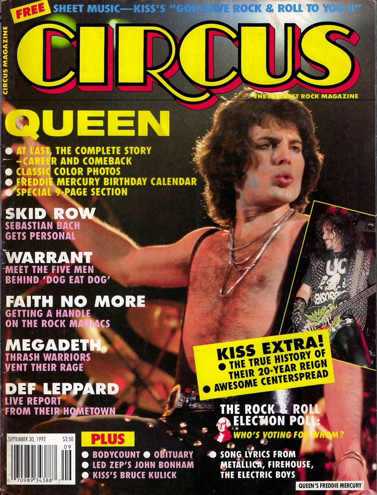
This Lostprophets album advert is a very simple advert that again reflects the subtle selling nature of this particular genre of music. The black and white aspect is a typical convention of the Rock album advertisments. The simple text/font also adds to the mysterious aspect of the genre that helps to sell the music. It is important to notice the part of the advert that mentions the albums' availability on iTunes and the band's website. This is all new technology that needs to be mentioned when I create my own album advertisement. I also like the intertextuality of this album advertisment as it is reminiscent of the iconic Queen video for the song Bohemian Rhapsody shown in this still image of the video;

THEM CROOKED VULTURES

This album advert is my favourite of my four examples because of it's simplicity and it's effectiveness. I am going to analyse this particular album advertisement for the Them Crooked Vultures album in my next blog post in much more detail because this band are the most similar to our band in terms of musical genre and creative direction.
Tuesday, 22 February 2011
Audience Feedback on First Draft and CD Digipak...
I sent out a message on Facebook to some friends that contained a link to our first draft of our music video and asked them to send me back some feedback with three aspects that they liked about the concept/camera shots/mise-en-scene/etc. I also got them to look at my blog and comment on my CD Digipak.
Here is the message I sent out to them;

Here are their responses to the first draft of our video and my CD Digipak;
RESPONDENT NO.1;
Here is the message I sent out to them;

Here are their responses to the first draft of our video and my CD Digipak;
RESPONDENT NO.1;
"This is really good, its hard to judge it overall with all the black bits so i shall tell u my fav parts... i really like the part with the pa desk thought it was quite an original idea and drew my attention. I liked it with the girl speaking upside down reflects the nature of the song. The shots of the band were good i like it in black and white and the set up of the equipment makes countys stage look pro lol. Not too sure about josh's face :) My other favorite part is with the lipstick marks on the guitar!
One thing i would say maybe the ending could be slightly different it seems a bit slow and is just lacking something........ but what do i know lol.... otherwise its really good... cant wait to see the finished product.
I also looked at your blog i think the cd cover u made is amazing!!!! Looks extremely pro :) xxx"

RESPONDENT NO.2;
"hey hey,
first off love the cd cover! looks amazing!
so....yeah like piano i loved the pa desk part! though it was catchy! And i liked the close up bit of the pile of torn out bits from the magazine when they were being taken off....do you know the part i mean? its kinda hard to explain, but yeah love that bit!! and also love the shots of the girl upside down! singing and crumbleing the paper etc....was really effective! so yeah those are the bits that i like! :D
in contarty to piano i think the end was really effective! and quite enjoyed it! :) i dont think you should change it!!
just curious as to what your gunna put in the black parts....?!"
So now we just need to add in all the new footage we are going to take into the black screens to complete the video, but it is getting really good responses so far! I am also pleased that people seem to like my CD Digipak design!
Thursday, 17 February 2011
Album Advertisements Research...
As part of our Advanced Portfolio coursework we have to produce an advertisement/poster to go alongside our CD Digipak in order to promote our band brand, music video and CD Digipak.


However, before I start to create my own Album Advertisement it is important for me to carry out some research into current Album Advertisements for the Alternative Rock genre that we are trying to conform to. It is also important for me to research into different genres use' of Album Advertisement in order for me to understand the different types of conventions which will then lead me to create the best possible Album Advertisement for my own genre.


I will be making comparisons - not only between different genres of advertisements - but also between modern and older Album Advertisements. I will be buying a selection of different music magazines and analysing some of the Album Promotions that they contain.
.jpg)

Tuesday, 15 February 2011
Audience Feedback...
I got my friends that were in the performance parts of our video to watch what we had done so far in terms of editing our music video and it turns out that people like our video so far! However we did get some feedback from them that some parts of the video didn't look as though they were completely in time with the beat of the music but that can be easily fixed and - apart from being embarresed by seeing themselves in our video - they really enjoyed the video so far!
(This was posted straight from my iPhone)
Thursday, 10 February 2011
Finally...
The full 4-piece CD Digipak that I have created for the self-titled album 'The Mags'...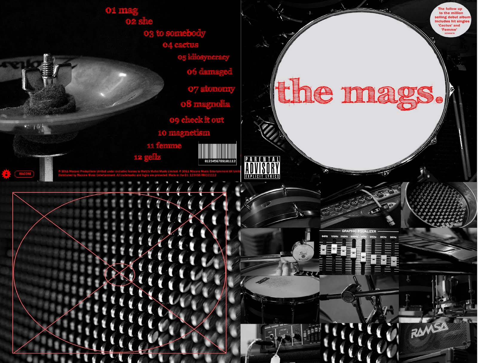
I am so happy with my final CD Digipak design because I feel as though it really fulfills the criteria of a stereotypical Alternative Rock band's album artwork, etc.
Final Individual Panels for my CD Digipak...
Here are the final individual edited panels that I created for my CD Digipak;
FRONT PANEL

INSIDE PANEL

INSIDE PANEL THAT HOLDS CD

BACK PANEL

Parental Advisory/Advertisement Stickers...
When looking at what I thought was my final edit of the front cover of my CD Digipak I realised that something was missing and it did not look realistic enough. So I went to my CD shelf again and looked at some more examples of existing album covers, etc. and realised I had not put a parental advisory sticker or an advertisement sticker on it yet! The parental advisory sticker is important for our particular genre of music as it can be used as a selling point to fans who buy into the mysterious/rebellious nature of the band.
Before and After;


Now I am much happier with how realistic my CD Digipak looks!
Inside Covers for my CD Digipak...
I eventually decided to go with my idea of having a compilation of the photos on the inside of the CD Digipak (the panel that does not hold the CD) and then have a plain/patterned photograph on the panel that holds the CD.
Here are my final two edited images for the inside panels of the CD Digipak...
Panel that holds a booklet/lyric sheet;

Panel that holds the CD itself;

I added in my own diagram of a CD bracket just to make sure I don't get confused/forget which I had chosen to be the panel that holds the CD itself, etc.
Back Cover of my CD Digipak...
So I eventually decided to go for this photograph as my back cover for my CD Digipak design because it has lots of blank space for me to edit the song titles, copyrights, etc. onto it;
First I edited all the 12 song titles around the curve of the bell so that the back cover was as aesthetically pleasing as the front cover of my CD Digipak. I then grabbed a CD case from my shelf and checked to see what small but significant details I had to include to make the cover look realistic.
This is when I added the copyright sentences at the bottom of the cover, the record labels logos (which I simply created on Photoscape) and eventually the barcode.
Here is my finished back cover for my CD Digipak;
Barcodes (cont.)...
Just found out I can change the colour/size of the lines etc. which is perfect for me as it means I can make it match my CD Digipak design. So here's what I came up with!;

Barcodes...
Whilst editing all of the text onto the back cover of my CD Digipak I realised I would need an image of a barcode on there to make it look realistic, so I found this website where you can create your own custom barcodes!
Here's the one I came up with for my CD Digipak...

www.dafont.com...
This website is what I used to find the perfect font for my CD Digipak design.

I spent a long time searching through the hundreds of different fonts on the website and eventually narrowed it down to five different fonts. I then tried them out on the front cover of my CD Digipak to see which one looked the most effective;

I liked the hand-written effect of this font but there is something slightly too gothic about it that makes it wrong for our particular genre of music.

I also liked this font because of it's interesting angles but it is too narrow and plain for it to work on this particular CD Digipak design.
Again this font is too small and plain to have the desired effect on this CD Digipak design.

Although I thought this font was very interesting, again it is slightly too gothic and dark, which is suggestive of a different genre that I am not trying to represent with my CD Digipak.


And finally, after searching through hundreds of fonts I found this one which works perfectly for the look I was hoping for on my CD Digipak. It is bold without being too edgy which reflects the musical genre we are trying to represent in the production of our music video.
This is the font I have decided to use for my CD Digipak design, so I downloaded it from dafont.com and saved it onto my CD Digipak front cover. Now I just need to add the song titles to the back cover, etc.
Here is the final front cover (as you can see we decided to stick with our simple theme and leave the album as a self-titled album - again the band name we chose, The Mags, ties in with our music video, as we have torn up pieces of magazines in lots of our shots as intertextuality);

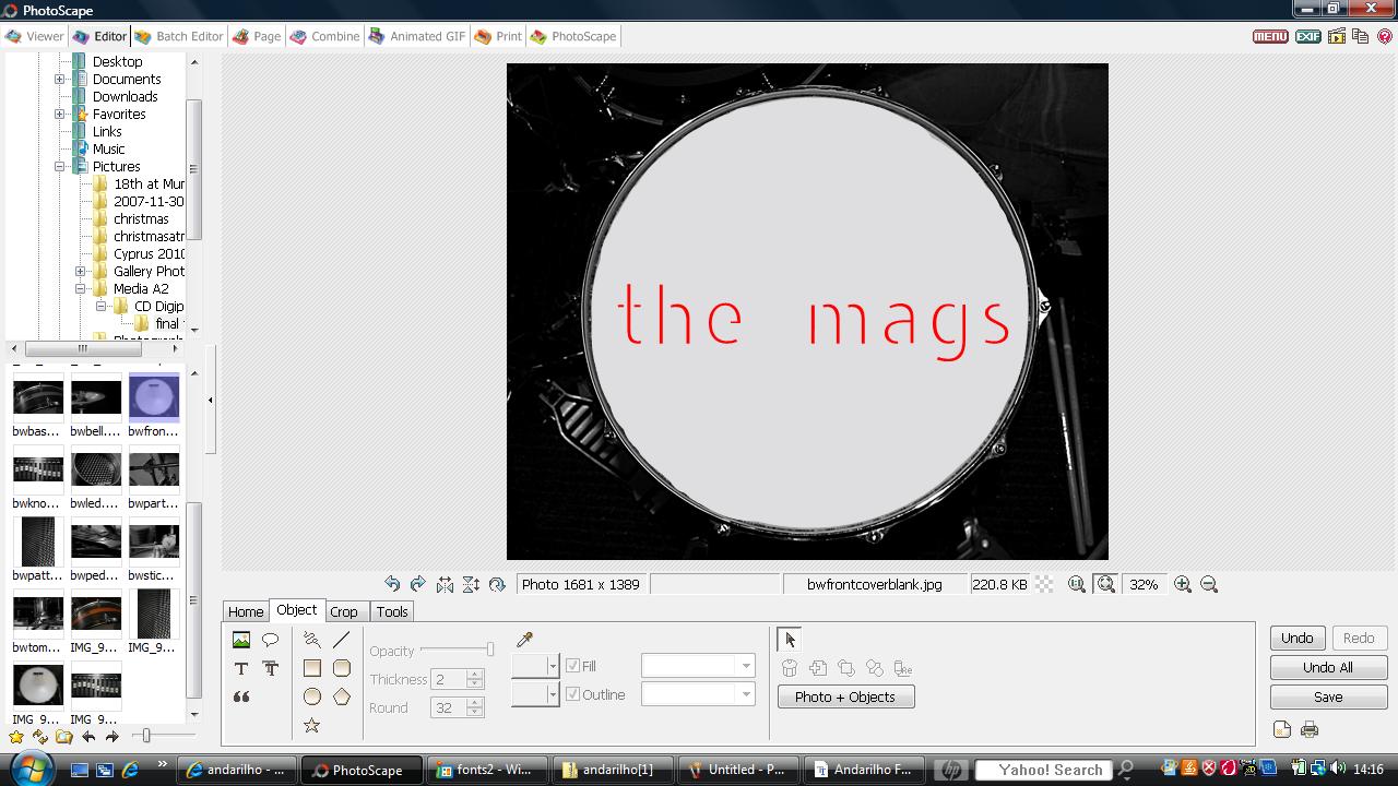
Chosen Photograph for Front Cover...
I decided to use this simple photograph for the front cover of my CD Digipak because it would provide a nice frame for the name of the band and the album title, etc. However, I had to edit out the marks and symbols on the drum skin to make room for the bold, red text I was going to use.
Here is the photograph before and after I edited out the scratches/symbols...

Now I just need to choose the photographs for the other three sides of the CD Digipak and then choose the font that goes best with the whole look of the CD Digipak.
Subscribe to:
Comments (Atom)
