

Here is my analysis of the Them Crooked Vultures album advertisement that I found in Kerrang! magazine;
Them Crooked Vultures Ad
Wednesday, 23 February 2011
In Depth Analysis of Them Crooked Vultures Album Advertisement...
Album Advertisement Research...
In order for me to produce a good design for my album advertisement it is essential for me to research into existing album adverts for the same genre of music (Alternative Rock). I went and bought some music magazines and looked through my collection of Kerrang! magazines to see what the conventions of an Alternative Rock album advert are.
As I was looking through my copies of Kerrang!, Q and NME I found these four adverts for different albums. They all belong two of them belong to a similar genre of music to Kings Of Leon/"The Mags" and one of them belongs to a slightly different genre of music, but it is good for me look at all sorts of album advertisements in order to understand how I need to produce a successful album advert as part of my coursework.
THE PRODIGY - Invaders Must Die
This album advert for The Prodigy's Invaders Must Die is the one of the four I chose that belongs to a slightly different genre of music to the other three examples I chose. The Prodigy describe their music as electronic rock with punk vocal elements so it is very different from the Alternative Rock genre that we are trying to represent but it is advertised in the same magazines as those of similar style to our genre. It is different from the others because it has a photo of the CD itself and lots of text rather than one large image like in the other adverts. I think this is an aspect of the album adverts that does not fit in with the conventions of our genre of music because it makes the selling aspect of the advert more obvious to the viewer, whereas for the other adverts it focuses more on the album artwork/bands creativity which takes the emphasis off the fact that they are ultimately trying to sell as many albums as possible.
YOUMEATSIX - Hold Me Down
This Youmeatsix album advert for Hold Me Down is a much simpler advert that the Prodigy example as it simply contains the same artwork that is shown on the album itself but with the date of the release, title, stores where it will be sold and the record labels logo. This is the typical album advertisment for Alternative Rock/Indie bands as it promotes their band branding as a creative and mysterious type which draws in their specific target market.
LOSTPROPHETS - The Betrayed
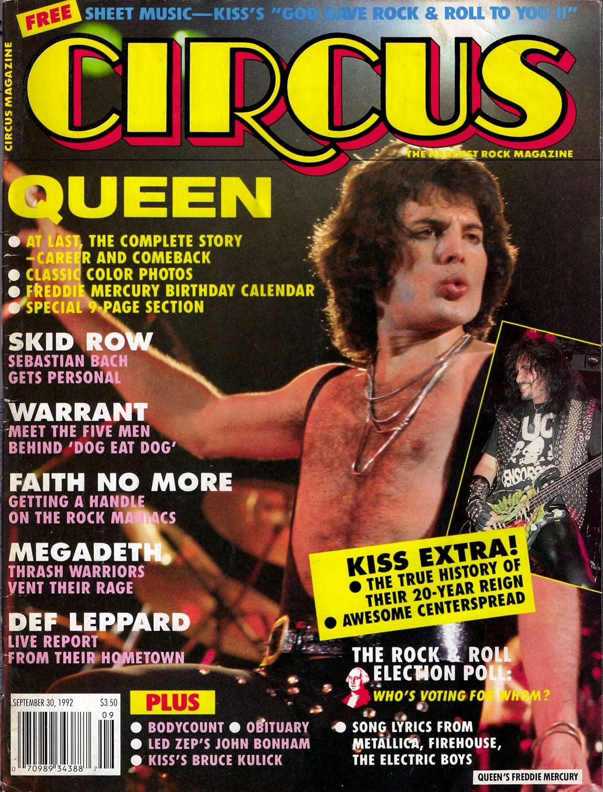
This Lostprophets album advert is a very simple advert that again reflects the subtle selling nature of this particular genre of music. The black and white aspect is a typical convention of the Rock album advertisments. The simple text/font also adds to the mysterious aspect of the genre that helps to sell the music. It is important to notice the part of the advert that mentions the albums' availability on iTunes and the band's website. This is all new technology that needs to be mentioned when I create my own album advertisement. I also like the intertextuality of this album advertisment as it is reminiscent of the iconic Queen video for the song Bohemian Rhapsody shown in this still image of the video;

THEM CROOKED VULTURES

This album advert is my favourite of my four examples because of it's simplicity and it's effectiveness. I am going to analyse this particular album advertisement for the Them Crooked Vultures album in my next blog post in much more detail because this band are the most similar to our band in terms of musical genre and creative direction.
Tuesday, 22 February 2011
Audience Feedback on First Draft and CD Digipak...
I sent out a message on Facebook to some friends that contained a link to our first draft of our music video and asked them to send me back some feedback with three aspects that they liked about the concept/camera shots/mise-en-scene/etc. I also got them to look at my blog and comment on my CD Digipak.
Here is the message I sent out to them;

Here are their responses to the first draft of our video and my CD Digipak;
RESPONDENT NO.1;
Here is the message I sent out to them;

Here are their responses to the first draft of our video and my CD Digipak;
RESPONDENT NO.1;
"This is really good, its hard to judge it overall with all the black bits so i shall tell u my fav parts... i really like the part with the pa desk thought it was quite an original idea and drew my attention. I liked it with the girl speaking upside down reflects the nature of the song. The shots of the band were good i like it in black and white and the set up of the equipment makes countys stage look pro lol. Not too sure about josh's face :) My other favorite part is with the lipstick marks on the guitar!
One thing i would say maybe the ending could be slightly different it seems a bit slow and is just lacking something........ but what do i know lol.... otherwise its really good... cant wait to see the finished product.
I also looked at your blog i think the cd cover u made is amazing!!!! Looks extremely pro :) xxx"

RESPONDENT NO.2;
"hey hey,
first off love the cd cover! looks amazing!
so....yeah like piano i loved the pa desk part! though it was catchy! And i liked the close up bit of the pile of torn out bits from the magazine when they were being taken off....do you know the part i mean? its kinda hard to explain, but yeah love that bit!! and also love the shots of the girl upside down! singing and crumbleing the paper etc....was really effective! so yeah those are the bits that i like! :D
in contarty to piano i think the end was really effective! and quite enjoyed it! :) i dont think you should change it!!
just curious as to what your gunna put in the black parts....?!"
So now we just need to add in all the new footage we are going to take into the black screens to complete the video, but it is getting really good responses so far! I am also pleased that people seem to like my CD Digipak design!
Thursday, 17 February 2011
Album Advertisements Research...
As part of our Advanced Portfolio coursework we have to produce an advertisement/poster to go alongside our CD Digipak in order to promote our band brand, music video and CD Digipak.


However, before I start to create my own Album Advertisement it is important for me to carry out some research into current Album Advertisements for the Alternative Rock genre that we are trying to conform to. It is also important for me to research into different genres use' of Album Advertisement in order for me to understand the different types of conventions which will then lead me to create the best possible Album Advertisement for my own genre.


I will be making comparisons - not only between different genres of advertisements - but also between modern and older Album Advertisements. I will be buying a selection of different music magazines and analysing some of the Album Promotions that they contain.
.jpg)

Tuesday, 15 February 2011
Audience Feedback...
I got my friends that were in the performance parts of our video to watch what we had done so far in terms of editing our music video and it turns out that people like our video so far! However we did get some feedback from them that some parts of the video didn't look as though they were completely in time with the beat of the music but that can be easily fixed and - apart from being embarresed by seeing themselves in our video - they really enjoyed the video so far!
(This was posted straight from my iPhone)
Thursday, 10 February 2011
Finally...
The full 4-piece CD Digipak that I have created for the self-titled album 'The Mags'...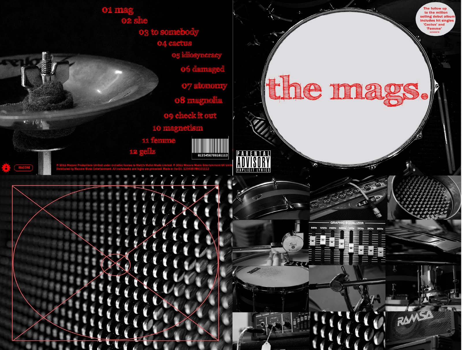
I am so happy with my final CD Digipak design because I feel as though it really fulfills the criteria of a stereotypical Alternative Rock band's album artwork, etc.
Final Individual Panels for my CD Digipak...
Here are the final individual edited panels that I created for my CD Digipak;
FRONT PANEL

INSIDE PANEL

INSIDE PANEL THAT HOLDS CD

BACK PANEL

Parental Advisory/Advertisement Stickers...
When looking at what I thought was my final edit of the front cover of my CD Digipak I realised that something was missing and it did not look realistic enough. So I went to my CD shelf again and looked at some more examples of existing album covers, etc. and realised I had not put a parental advisory sticker or an advertisement sticker on it yet! The parental advisory sticker is important for our particular genre of music as it can be used as a selling point to fans who buy into the mysterious/rebellious nature of the band.
Before and After;


Now I am much happier with how realistic my CD Digipak looks!
Inside Covers for my CD Digipak...
I eventually decided to go with my idea of having a compilation of the photos on the inside of the CD Digipak (the panel that does not hold the CD) and then have a plain/patterned photograph on the panel that holds the CD.
Here are my final two edited images for the inside panels of the CD Digipak...
Panel that holds a booklet/lyric sheet;

Panel that holds the CD itself;

I added in my own diagram of a CD bracket just to make sure I don't get confused/forget which I had chosen to be the panel that holds the CD itself, etc.
Back Cover of my CD Digipak...
So I eventually decided to go for this photograph as my back cover for my CD Digipak design because it has lots of blank space for me to edit the song titles, copyrights, etc. onto it;
First I edited all the 12 song titles around the curve of the bell so that the back cover was as aesthetically pleasing as the front cover of my CD Digipak. I then grabbed a CD case from my shelf and checked to see what small but significant details I had to include to make the cover look realistic.
This is when I added the copyright sentences at the bottom of the cover, the record labels logos (which I simply created on Photoscape) and eventually the barcode.
Here is my finished back cover for my CD Digipak;
Barcodes (cont.)...
Just found out I can change the colour/size of the lines etc. which is perfect for me as it means I can make it match my CD Digipak design. So here's what I came up with!;

Barcodes...
Whilst editing all of the text onto the back cover of my CD Digipak I realised I would need an image of a barcode on there to make it look realistic, so I found this website where you can create your own custom barcodes!
Here's the one I came up with for my CD Digipak...

www.dafont.com...
This website is what I used to find the perfect font for my CD Digipak design.

I spent a long time searching through the hundreds of different fonts on the website and eventually narrowed it down to five different fonts. I then tried them out on the front cover of my CD Digipak to see which one looked the most effective;

I liked the hand-written effect of this font but there is something slightly too gothic about it that makes it wrong for our particular genre of music.

I also liked this font because of it's interesting angles but it is too narrow and plain for it to work on this particular CD Digipak design.
Again this font is too small and plain to have the desired effect on this CD Digipak design.

Although I thought this font was very interesting, again it is slightly too gothic and dark, which is suggestive of a different genre that I am not trying to represent with my CD Digipak.


And finally, after searching through hundreds of fonts I found this one which works perfectly for the look I was hoping for on my CD Digipak. It is bold without being too edgy which reflects the musical genre we are trying to represent in the production of our music video.
This is the font I have decided to use for my CD Digipak design, so I downloaded it from dafont.com and saved it onto my CD Digipak front cover. Now I just need to add the song titles to the back cover, etc.
Here is the final front cover (as you can see we decided to stick with our simple theme and leave the album as a self-titled album - again the band name we chose, The Mags, ties in with our music video, as we have torn up pieces of magazines in lots of our shots as intertextuality);

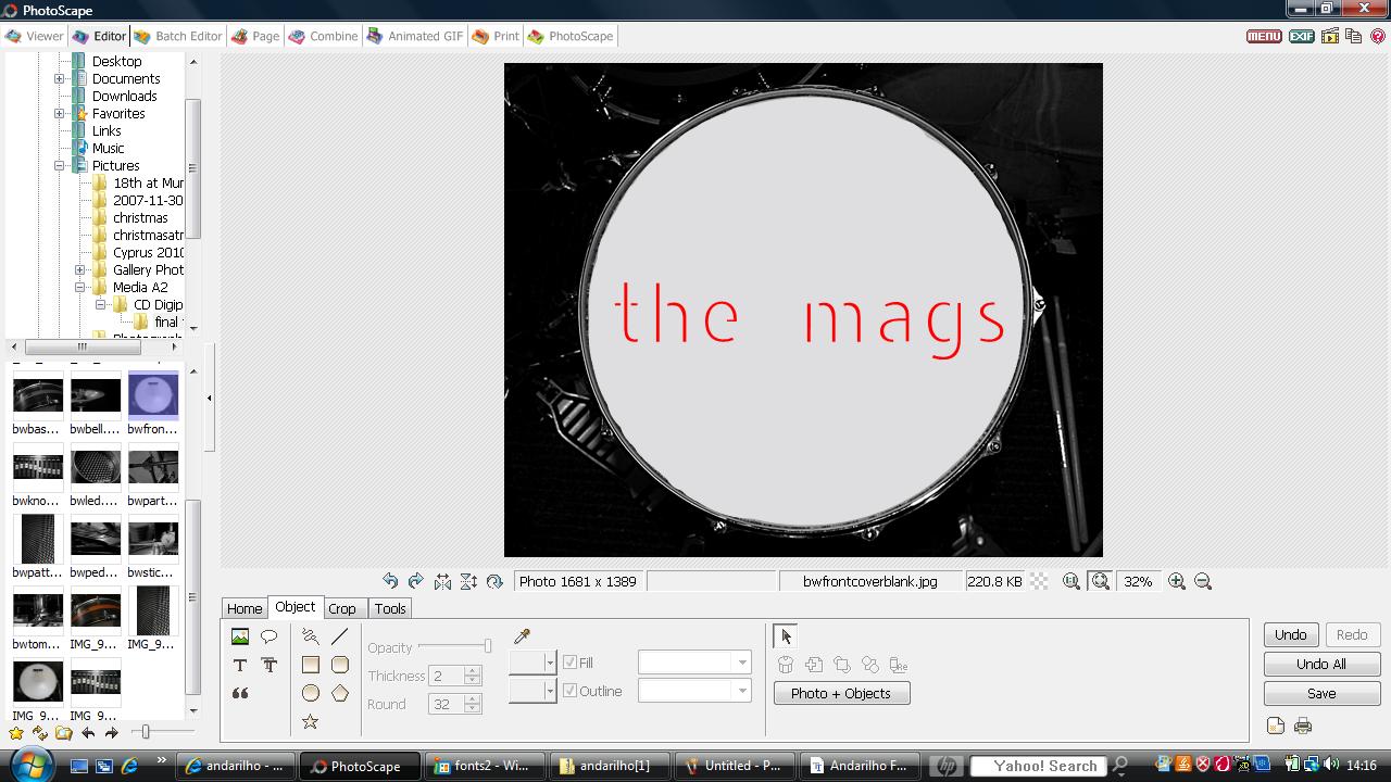
Chosen Photograph for Front Cover...
I decided to use this simple photograph for the front cover of my CD Digipak because it would provide a nice frame for the name of the band and the album title, etc. However, I had to edit out the marks and symbols on the drum skin to make room for the bold, red text I was going to use.
Here is the photograph before and after I edited out the scratches/symbols...

Now I just need to choose the photographs for the other three sides of the CD Digipak and then choose the font that goes best with the whole look of the CD Digipak.
Tuesday, 8 February 2011
Photos for my CD Digipak...
When I went to film the Stop Motion footage of the Soundboard last night, I also went and took lots of photographs of drums and other musical equipment for me to use on my CD Digipak. I already knew that I wanted to keep the design very simple with black and white photographs of musical equipment; a drum on the front cover, etc. with red text on it.
Here is a PowerPoint Presentation with a selection of the photographs I took before any editing on Photoshop; I am not entirely sure which ones I will be definitely using yet but I am going to narrow down my choices to 4 very soon...
Photographs for CD Digipak
A bit of Audience Feedback...
Whilst we were editing today there were a few other people in the media room that saw what we were doing with the stop motion of the Soundboard and everyone seemed to really like that particular part of our video! Nice to hear positive feedback and see how people who haven't been staring at the footage for hours react to it!
Soon we are going to get a group of people to watch our most recent draft and film their responses on the flip camera to put onto our blogs.
Editing/Drafts...
We've just been editing our music video on the new iMacs that we have in our Media Studies room and here is what we have done so far on iMovie! Once we are happy with what we have done on iMovie we will eventually move it all over to the iMac that has Final Cut Pro on it in order to make the final touches on the video.
Today I have spent quite a while trying to fit the stop motion parts that we had edited previously into the blank spaces we had in our music video and as a group we edited the stop motion of the Soundboard and Charlotte and Sarah continued to edit the build up of the song with the flashing black transitions towards the end of the song, just like in this existing music video by The Wombats for their song Let's Dance To Joy Division;
Here is a still shot from The Wombats' video and the similar one in our own video that we created;

(although it's hard to see on a print screen of the videos but the shots gradually get darker until it looks as though they are flashing black)


We thought this technique would be perfect for the build up of the song in our music video as it is a simple way to gradually build up the momentum and pace of the video after taking it right down for the bridge, etc.
Here is the latest draft of our music video with black screens where we need to fill in with new footage;
I am really pleased with what we have done so far but obviously there is still a bit more footage that we need to slot into the blank spaces in our music video, but so far I am really pleased with how it has all worked out.
I've found that as a group we have had more differences in creative opinion with this year's work than we ever did in our AS foundation portfolio work; but I think this just shows how developed our skills have become, as we are all striving to produce the best possible music video. Even though we sometimes disagree on some aspects of the editing, etc. it has been a good thing because we have had a chance to really think through every single thing we do in our production of the music video.
Stop Motion Soundboard...
Last night I went down to my church and filmed lots of 2 second clips of a soundboard and moved each sliding button so that when we edited it together today, it looks as though they are moving up and down of their own accord.
Today we uploaded and edited all of these clips together and then eventually I added the sequence into our actual video. However, here is the sequence of shots itself;
We decided to put an effect on these shots called Hard Light before desaturating the shot (to make it black and white) because it looked better for this particular shot than the Vignette effect we had used on all of the Performance shots. We chose to desaturate all of the band/instrument shots due to the colour of the curtains on the stage and the fact that we felt the shots were more effective when in black and white. This also fits in with my ideas for my CD Digipak.
I love this stop motion sequence of the Soundboard and I think it will be really effective in our music video for Charmer towards the end of the video; however, we will probably have to split up this sequence because it is slightly too long for our music video.
Subscribe to:
Comments (Atom)
