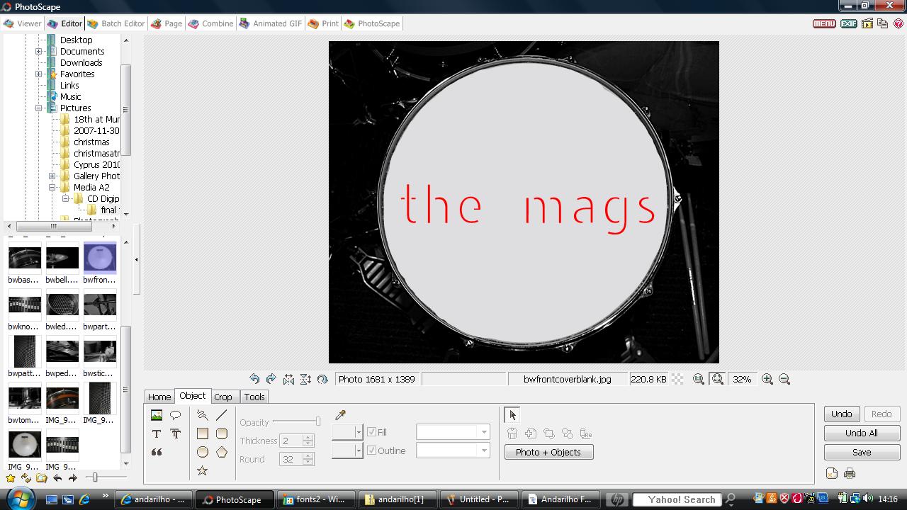
When looking at what I thought was my final edit of the front cover of my CD Digipak I realised that something was missing and it did not look realistic enough. So I went to my CD shelf again and looked at some more examples of existing album covers, etc. and realised I had not put a parental advisory sticker or an advertisement sticker on it yet! The parental advisory sticker is important for our particular genre of music as it can be used as a selling point to fans who buy into the mysterious/rebellious nature of the band.
Thursday, 10 February 2011
Parental Advisory/Advertisement Stickers...
Posted by Molly Wing at 08:49 0 comments
Labels: Album Covers, CD Digipak Designing/Editing, CD Digipak Ideas, CD Digipak Research, CD Digipaks, Font Ideas for CD Digipak, Making my CD Digipak look realistic, Parental Advisory Stickers
www.dafont.com...
This website is what I used to find the perfect font for my CD Digipak design.

Posted by Molly Wing at 06:36 0 comments
Labels: CD Digipak Ideas, CD Digipaks, Font Ideas for CD Digipak, Photographic Ideas for CD Digipak, Reasons for Band Name
Chosen Photograph for Front Cover...
I decided to use this simple photograph for the front cover of my CD Digipak because it would provide a nice frame for the name of the band and the album title, etc. However, I had to edit out the marks and symbols on the drum skin to make room for the bold, red text I was going to use.
Posted by Molly Wing at 06:23 0 comments
Labels: CD Digipak Ideas, CD Digipaks, Effect of Black and White, Font Ideas for CD Digipak, Photographic Ideas for CD Digipak, Research and Planning